Kick off
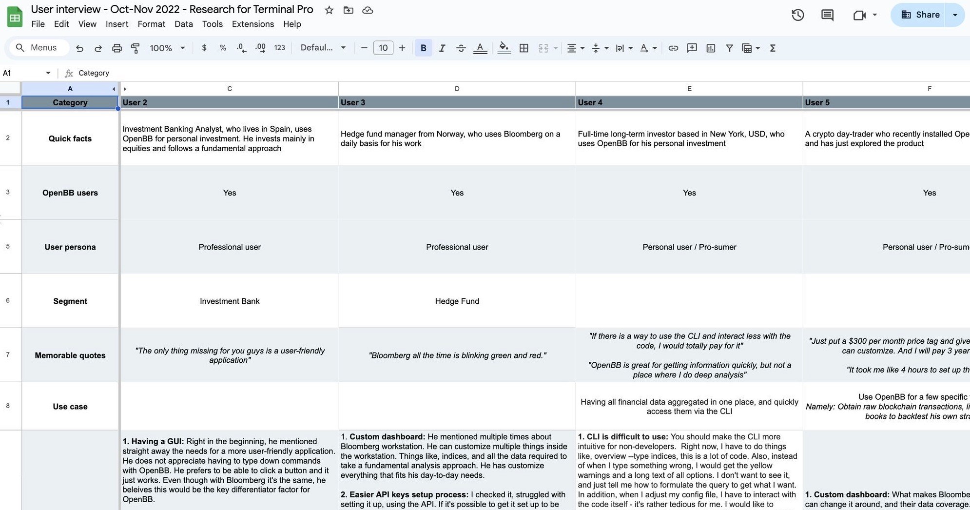
Patterns emerging
Demanding a graphic user interface either directly or indirectly referencing competitor products such as the industry-leading Bloomberg Terminal.
Ability to customise a work space to fit their needs and daily tasks.
Having access to proper data for research even if it's not real-time.
Lack of easy options in competitor products to share the research with other stakeholders.
Using their own data and overlaying different asset classes time series on the same chart.
Team setup and process
Team
Started with 4 people.
👩🏽💻👨🏻💻👨🏼💻👨🏽💻
PM, UX Lead, Front-end dev, Back-end dev
+ added more along the way once we defined a solid base
👩🏻💻👨🏻💻👨🏼💻👨🏽💻👨🏼💻👨🏿💻+
UI Designers, Back-end devs, Data scientist, AI scientist, Dev op, +
Process
Daily stand-up. 3-week sprints.
User test soon and often.
All active contributors would have a 15 minutes daily standup to talk progress, bumps, request help or feedback.
After initially working on a 2-week sprint, we decided that a 3-week sprint might work better due to the variety of the work being done on different fronts. The development impact for stakeholders was more drastic and we could showcase more robust work after a 3-week sprint.
We concluded each sprint with a presentation for stakeholders and an internal retrospective.
The chosen design model for moving forward was double diamond which suited well our project.
Initial mockups
Our assumptions were to create a solution that is tied to the existing terminal and considered being able to apply commands to different financial tickers.
This all changed once we started tested early with real financial professionals.
First set of rough mockups with initial assumptions
Testing early contoured the path
While we were trying to bridge a connection to our existing CLI product, testing revealed that we need an entire new solution.
Subsequently we aimed to test with at least 3 persons each week going forward.
Early findings
Discovery 1
Desktop versus Web
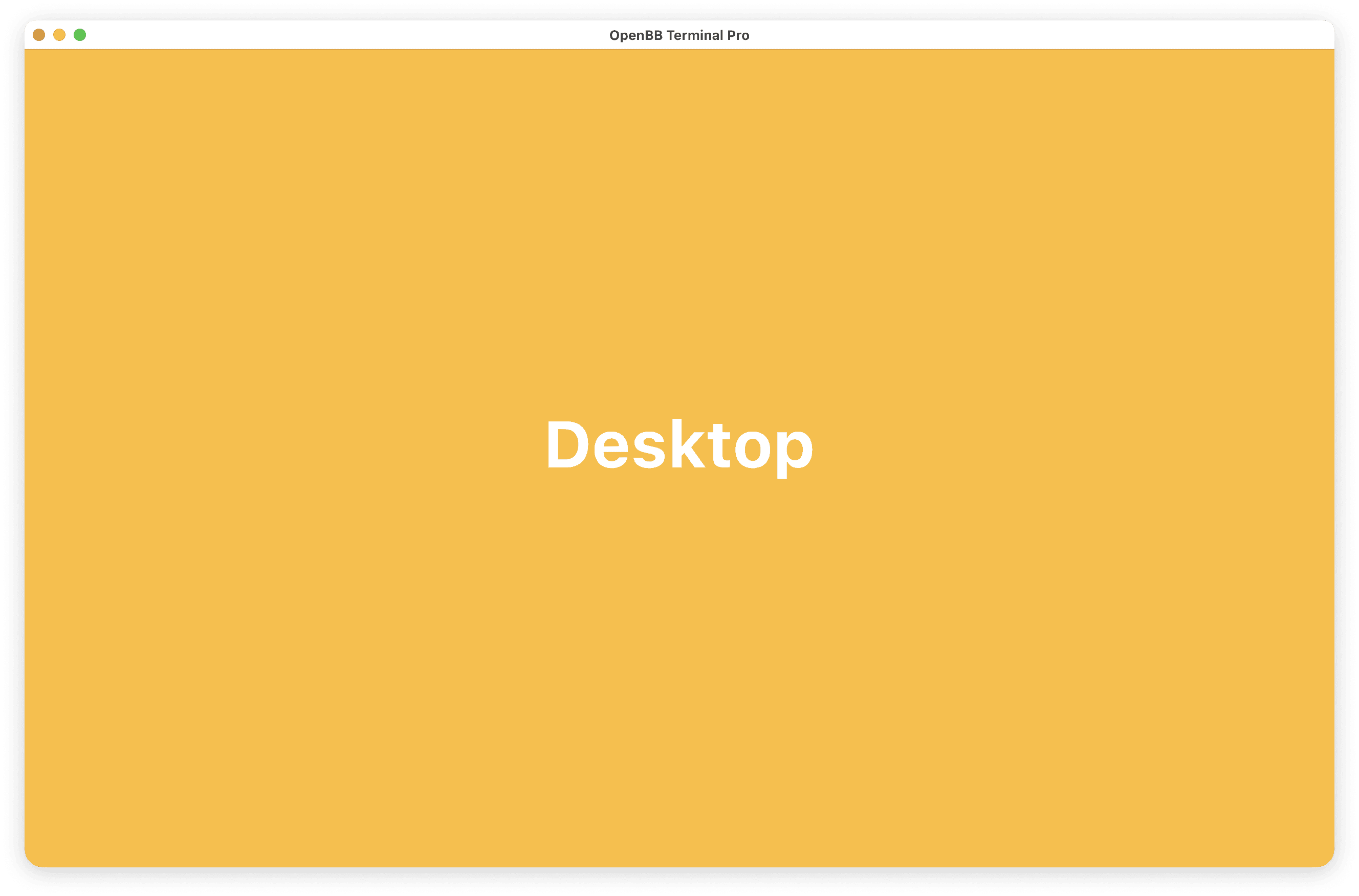
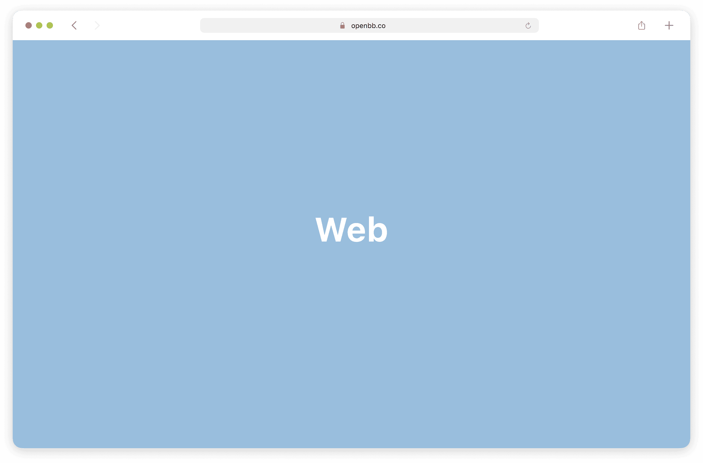
One of our big questions was if we should create a desktop app or a web solution. We included this among the testing questions and from the user feedback and internal technical assessment we concluded that the web is the winner.
🏆 Winner
Discovery 2
Commands are old school
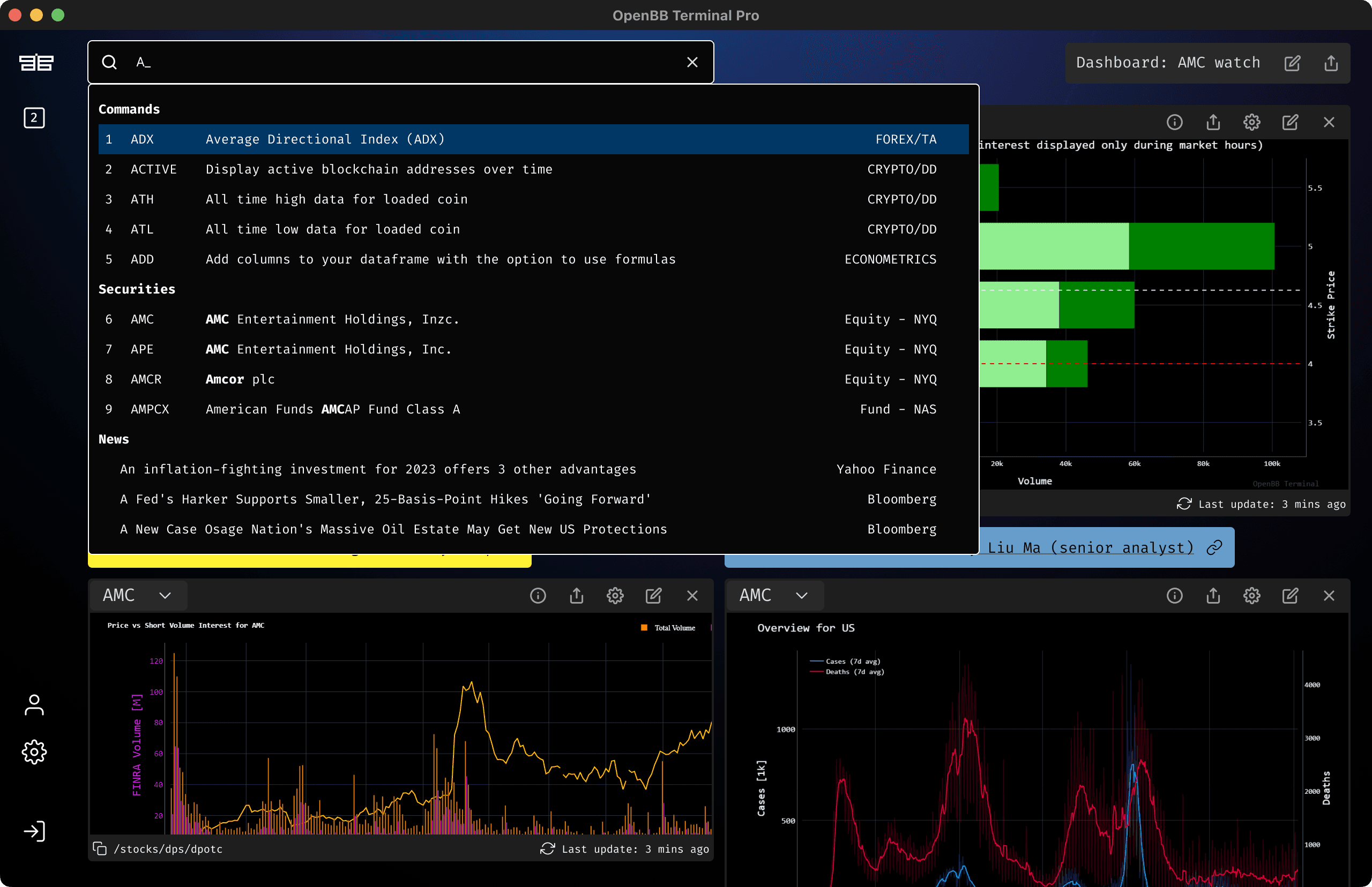
The original solution of the CLI terminal, one that is similar to Bloomberg's Terminal, was to load a symbol then apply a command. The result would be related to the symbol loaded.
It's an incremental approach, difficult to learn and with low discovery.
Discovery 3
Customise everything
Every user has a different work process and is interested in all types of investments so there won't be any two work spaces that will be similar.
Discovery 4
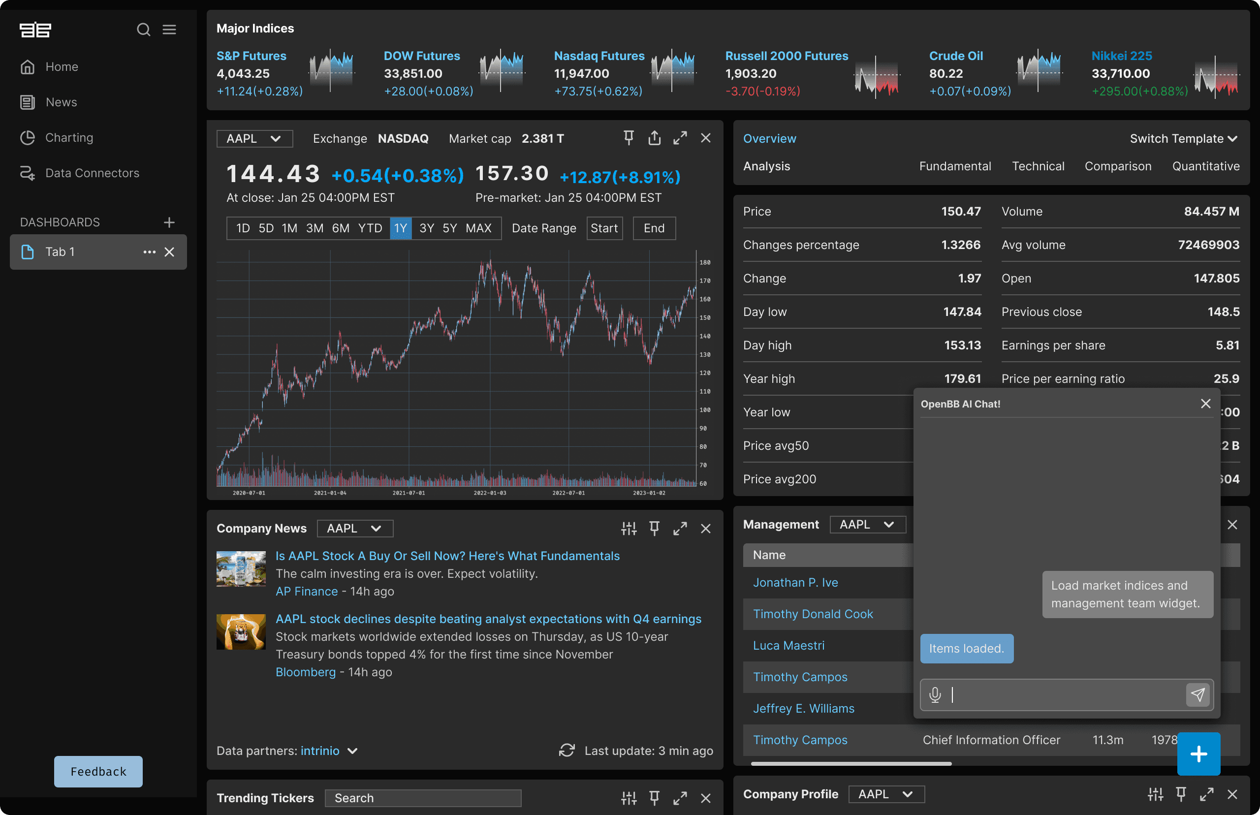
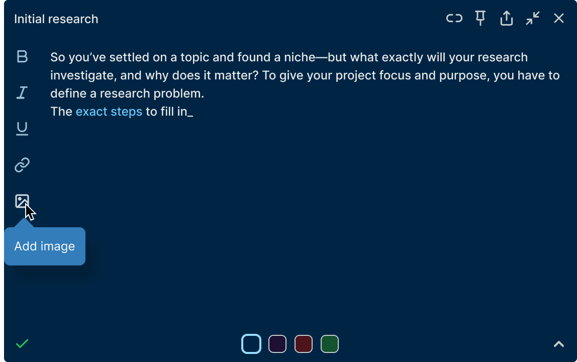
Dark versus Light
Based on our research and testing dark mode was edging slightly ahead. We decided to implement both to cover all scenarios. We considered this feature high impact, low effort.
Reframing the problem
Each financial professional has a distinct way of working.
The platform should be fully customisable.
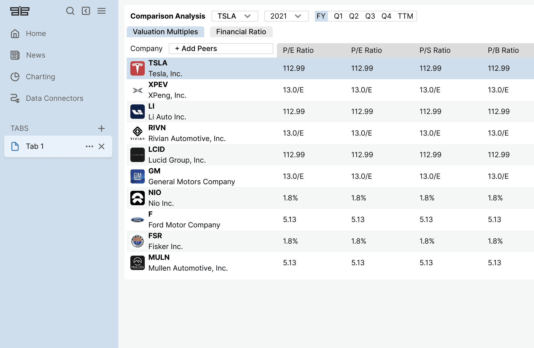
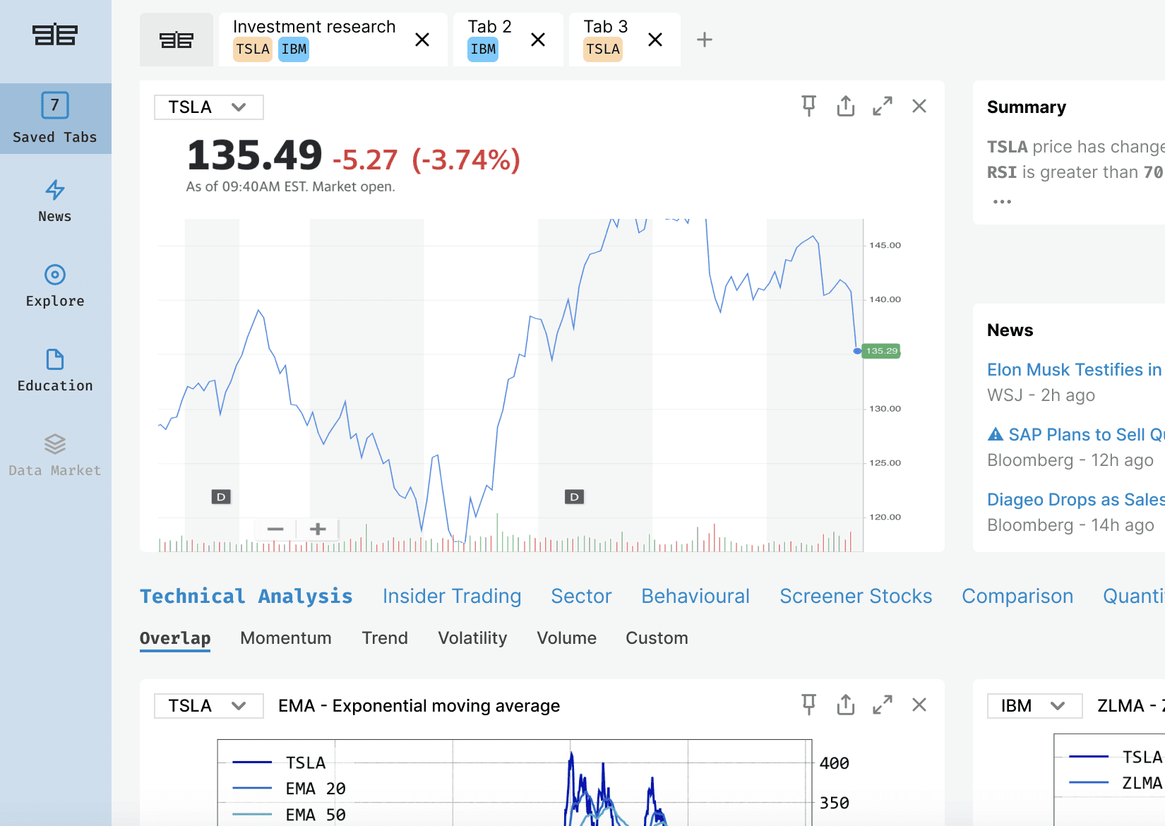
Work spaces are needed. We call them Tabs.
This actually matched out initial assumptions, that the users will need to work on multiple types of information at the same time, comparing and researching.
We have tested different types of navigation and chose a sidebar navigation as the solution that fitted all our needs.
It allows for grouping and actions for tabs or folders.
🏆 Winner
Everything is a widget
The breakthrough that pointed the direction.
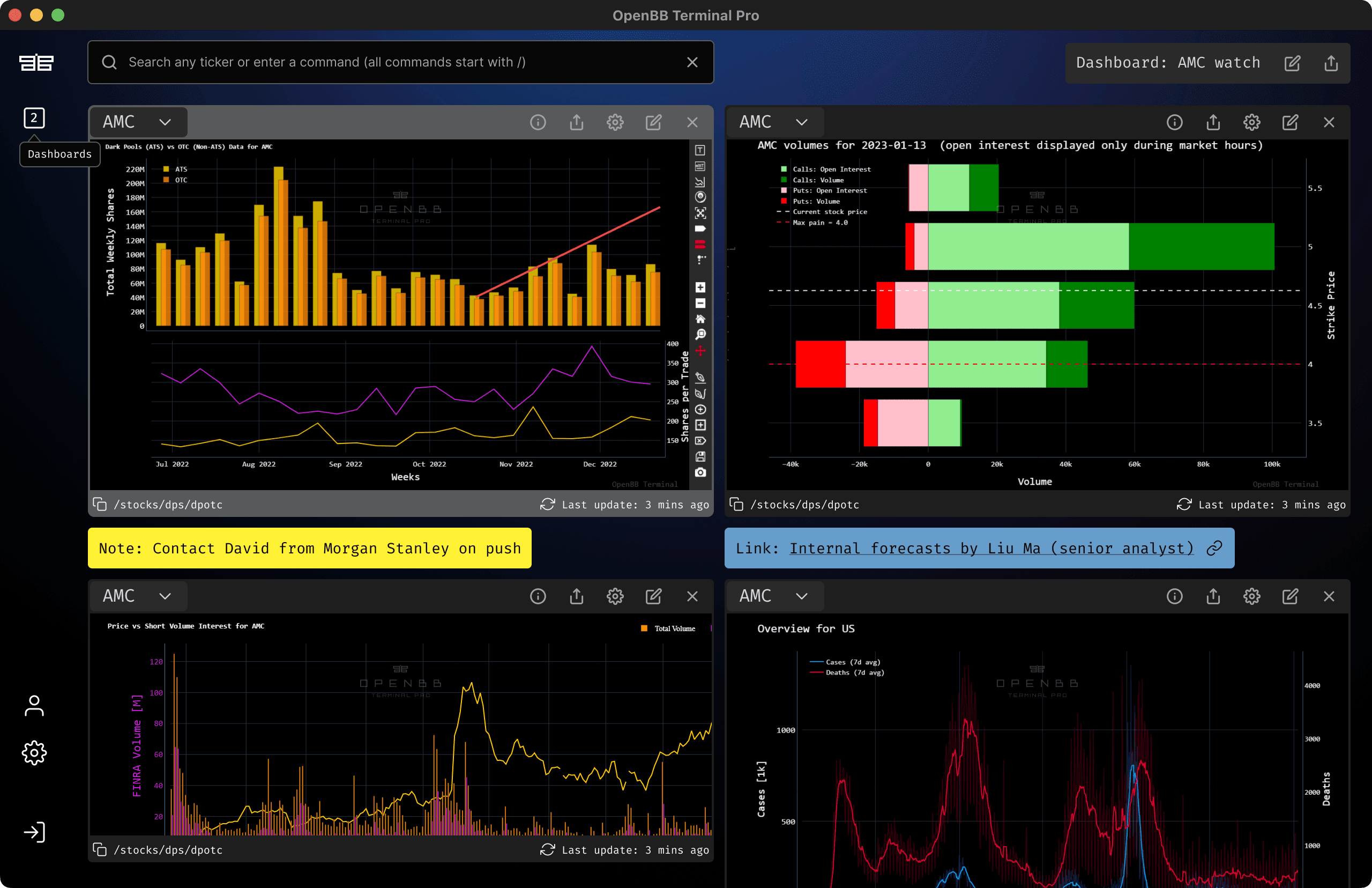
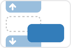
We took the decision that any item available on screen should be treated as a widget. This meant it could be hidden, moved, resized, made full screen or even moved to another tab.
Two big wins ✌️
Allows for infinite scaling.
The AI co-pilot we introduced to handle data can access all information in widgets regardless of the data source.
Widget anatomy
We ended up designing over 30 widgets for the MVP.
Solution
Say hello to Terminal Pro
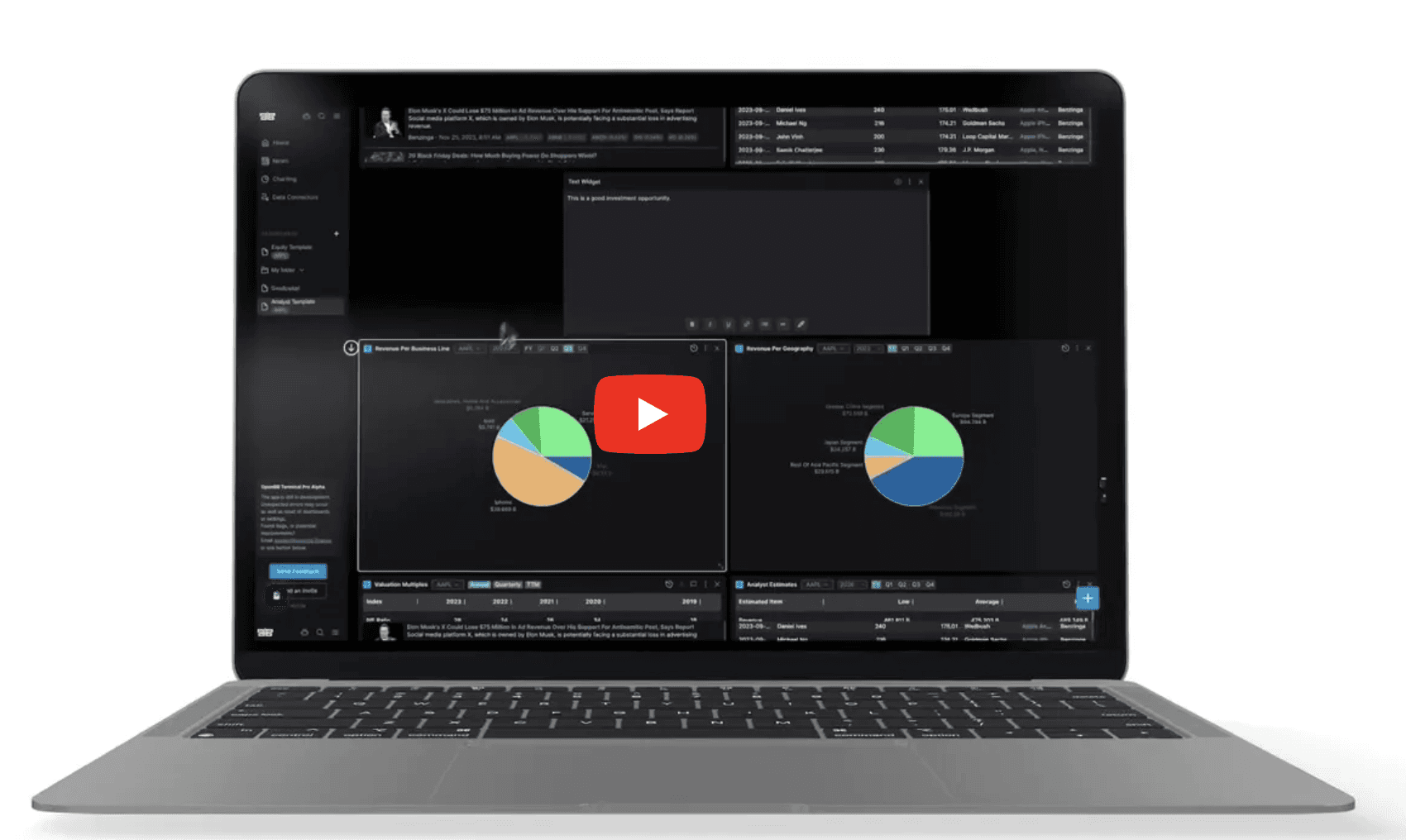
Watch the video reel below ▶
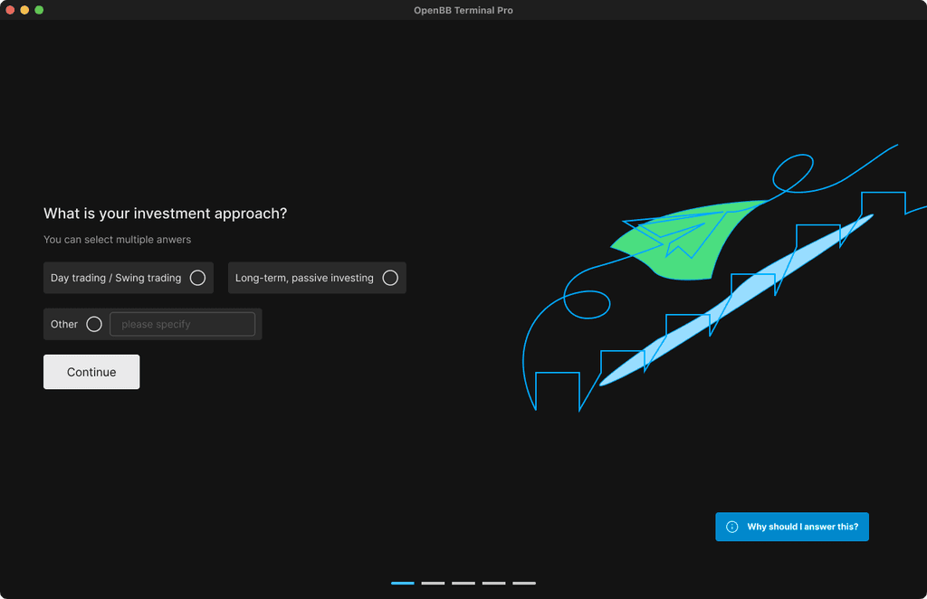
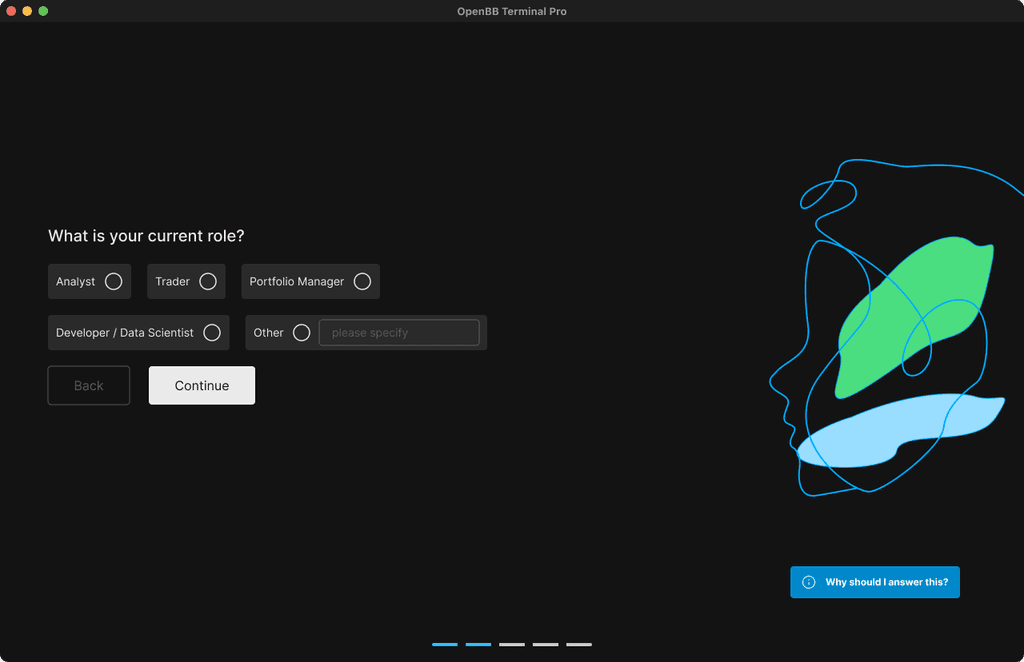
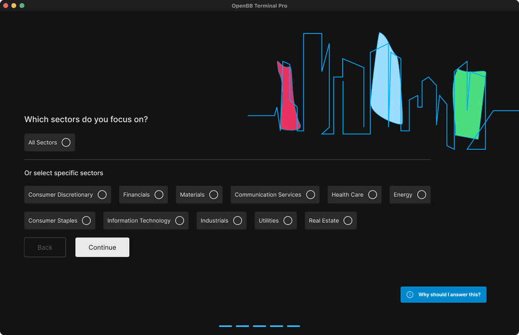
Onboarding
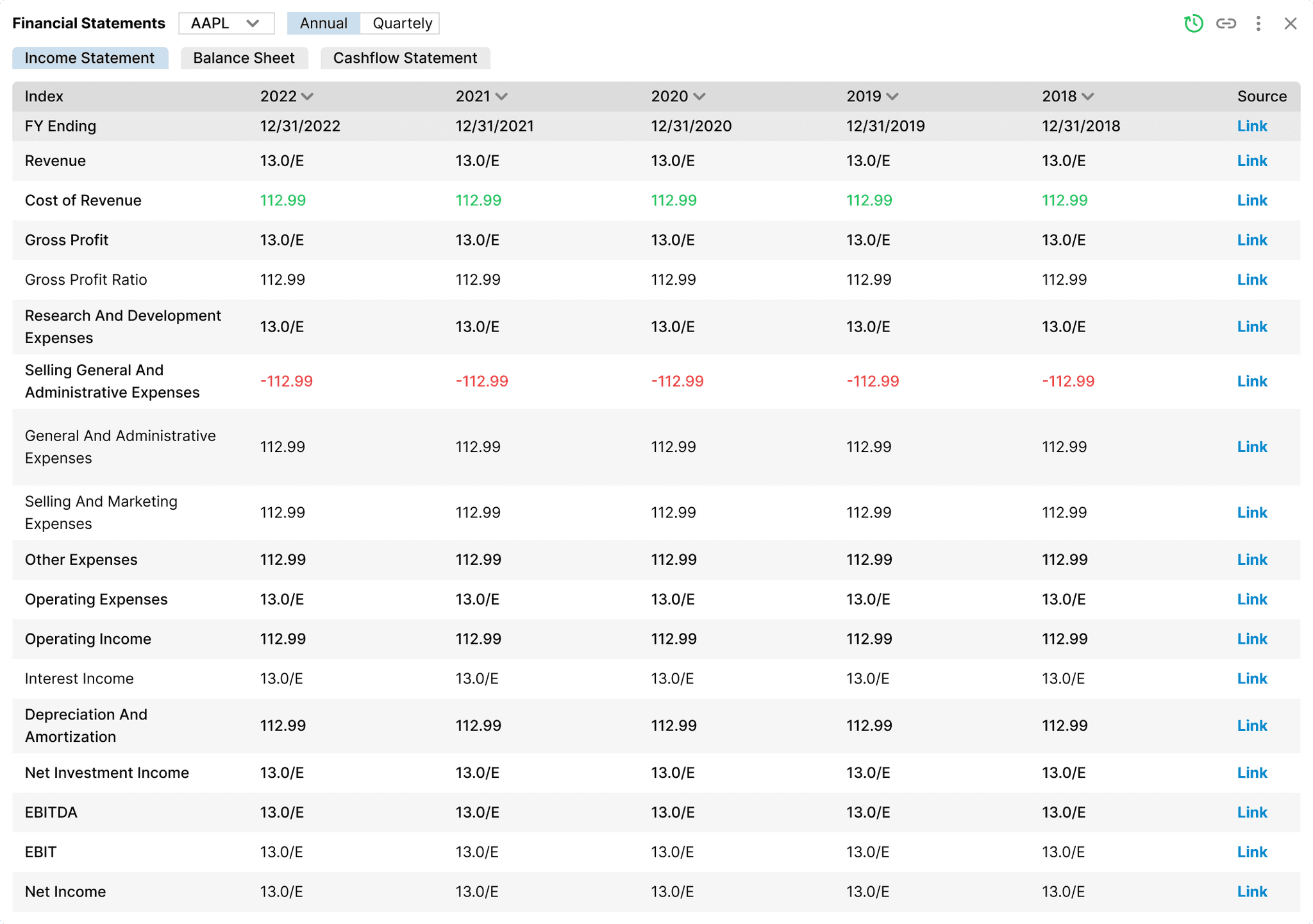
Widgets
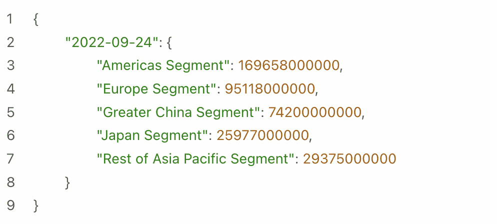
From code to design
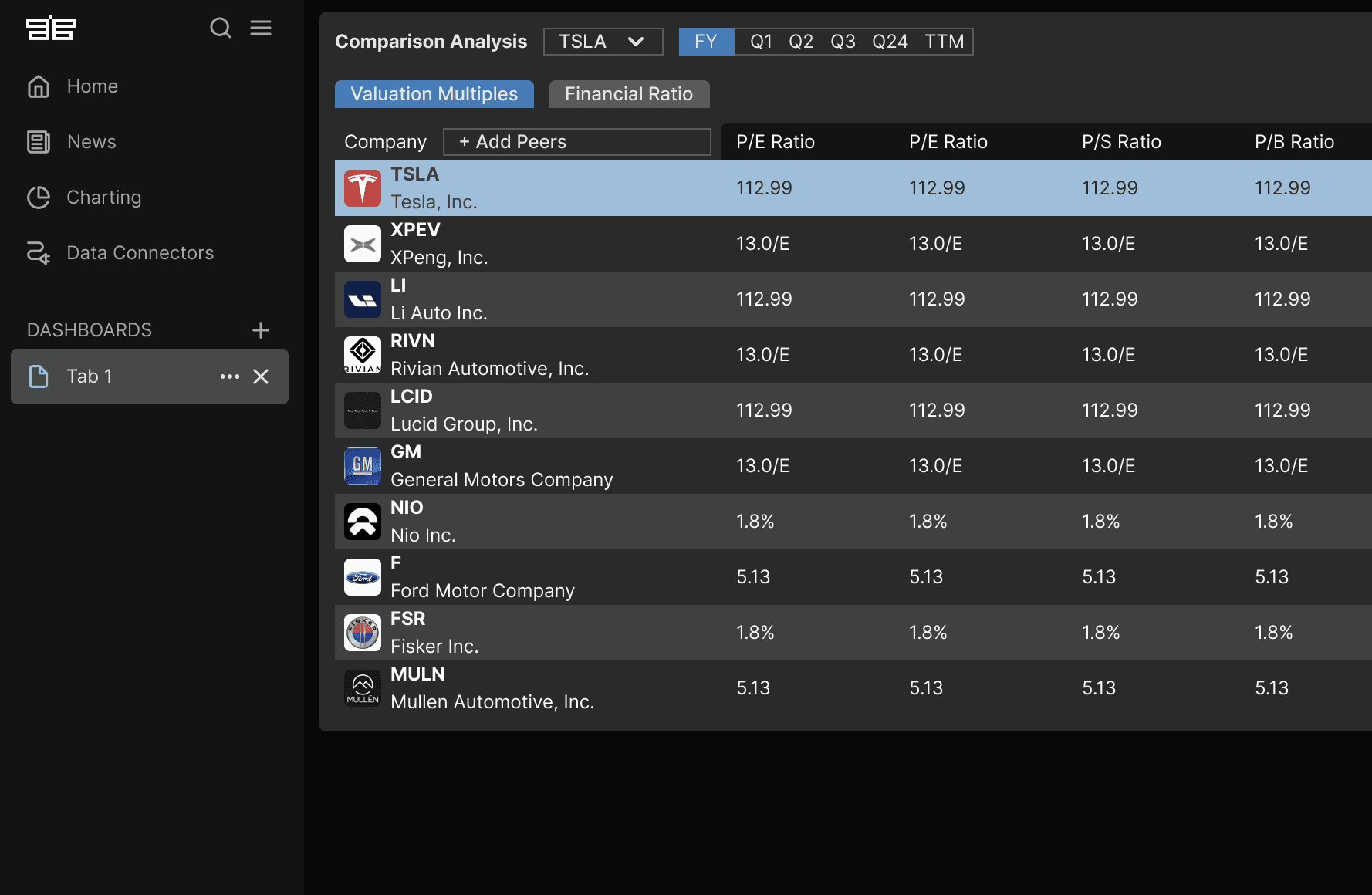
We were receiving strings of data from data providers and had to transform everything in a visual way.
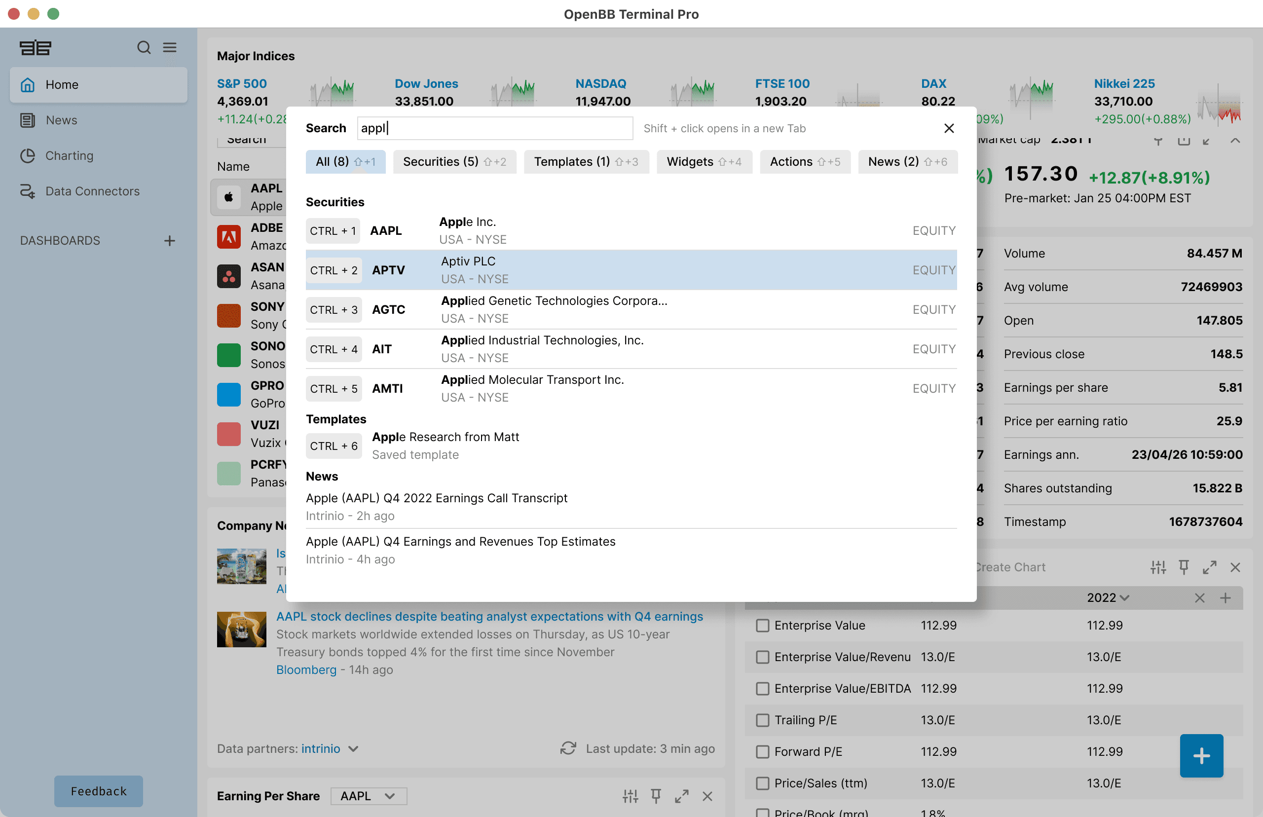
Advanced Search
One of the most important component was the ability to quickly find a ticker, widget, news or template. A prerequisite was being able to perform this action using just the keyboard. We went through multiple iterations and continuously testing.
Widget grouping
When a stock ticker changes for a group, all widgets in that group automatically update to match it.
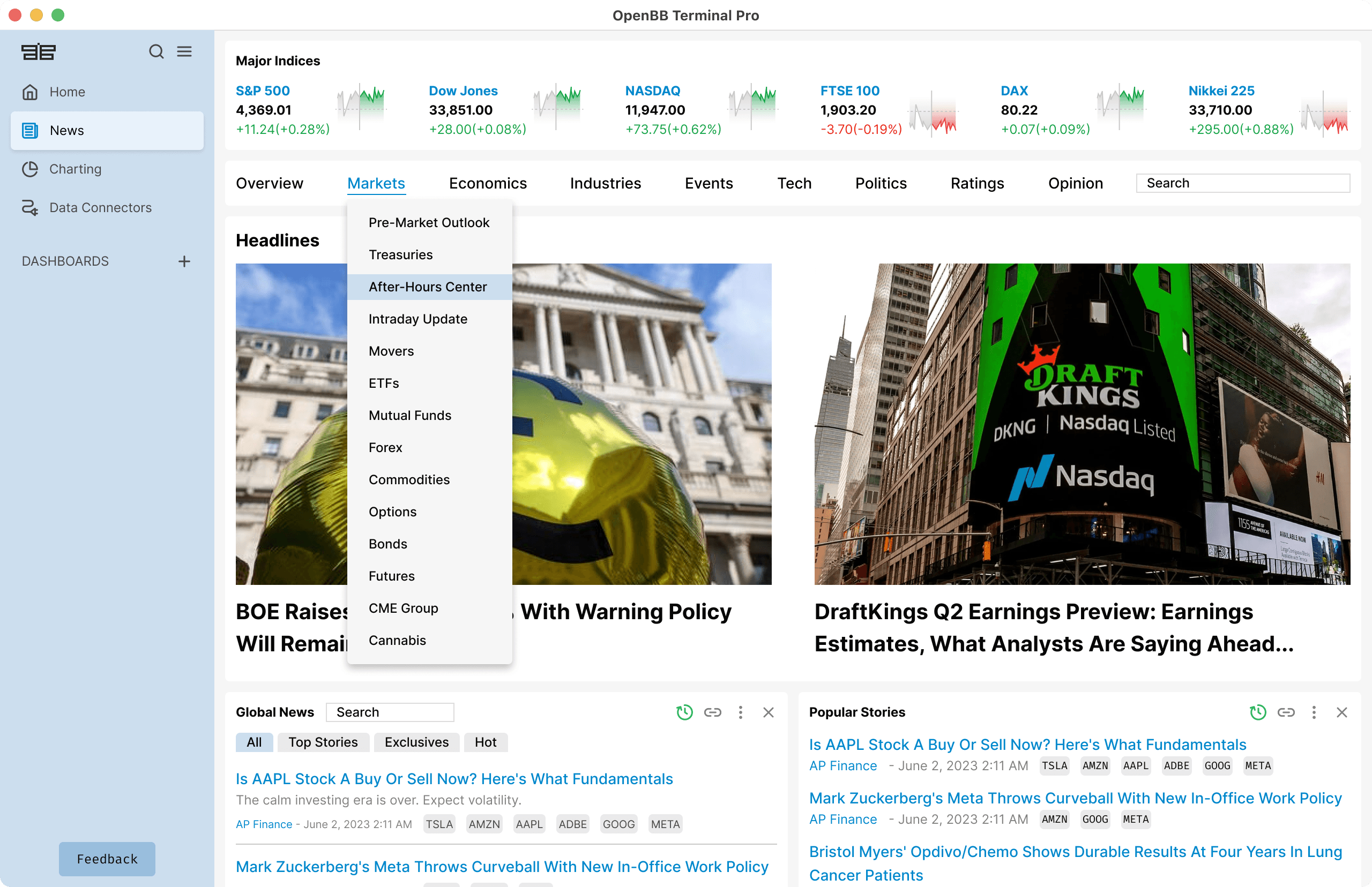
News section and AI summarisation
We found out through speaking with the users that they normally get their news from wherever they can, being free or paid services. We asked: what would be one key feature you would ideally have in a news? The answer came immediately: it would be great to have a summary so I don't have to spend so much time reading them.
We delivered. All our news can be summarised using AI.
AI co-pilot
An industry first. Users can discuss their investments since it can access all the financial data on the Terminal Pro — either provided by OpenBB or from their own files.
Notes
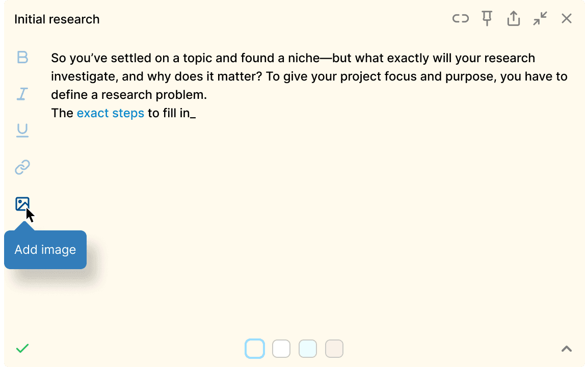
Rich notes for yourself or others when sharing the research. A highly useful tool.
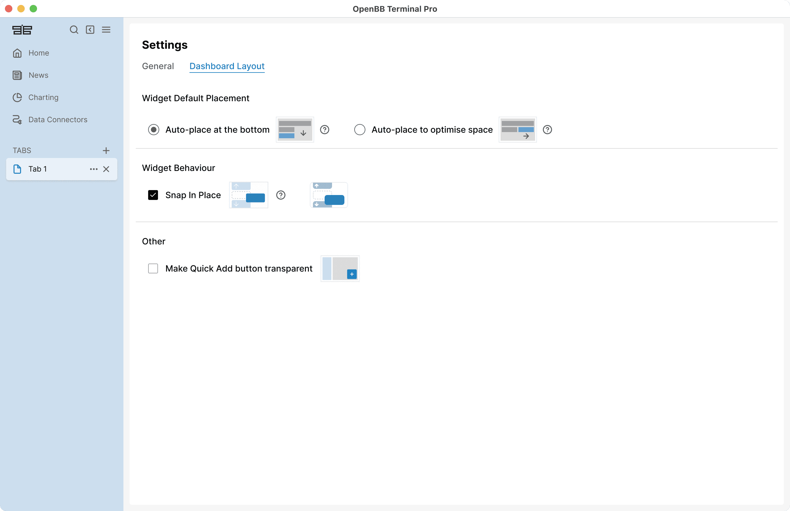
Settings
Ability to further customise the workspace.
Results
Impact
1st
2x
Growth since beta launching in October 2023.
To the moon! 🌖
Next case study
ExpressVPN Router
